This Is Google's Redesigned Logo
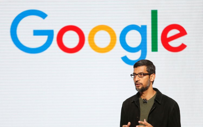
Google unveiled a redesign of its iconic logo on Tuesday, the fifth such modification since the search engine giant started in 1998.
The new logo spells 'Google' in a sans-serif typeface, similar to the one being used by Google's newly created holding company, Alphabet.
The logo bids farewell to the little blue "g" icon and replaces it with a uppercase "G" colored in blue, red, yellow and green to match the full logo.
The new brand identity "aims to make Google more accessible and useful to our users", the company said in a blog post.
The new logo comes three weeks after the company's surprise move to create a holding company called Alphabet to pool its many subsidiaries and separate the core web advertising business from newer ventures.


