Mozilla Simplifies Firefox Logo Design
Mozilla has decided to bring a a visual refresh of the Firefox logo and product icon, which have been modernized to reflect Firefox's role in the ever-changing Web of 2013 and beyond.
Not too long ago, Firefox was a desktop browser, plain and simple. However, as the
Web has grown and developed in new ways, so has Firefox ? it?s now a browser for
Android, Mac, Windows and Linux as well as an apps marketplace and a brand new
mobile operating system.
With all that in mind, Mozilla is redesigning the logo of the popular browser. Unlike previous versions, the updated logo was created specifically with mobile in mind, as it's been optimized to be crisper and cleaner on small screens and lower resolution devices. However, it also scalesnicely for use in retina displays, and (unlike previous versions) can be accurately recreated in SVG.
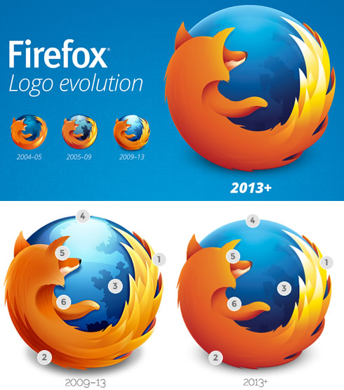
The changes are not so obvious at a glance, but you can see them in the picture below:
Mozilla's designers have tried to simmplify the logo's style without bringing it down to basic geometric shapes and solid colors. Instead, they have chosen to bring simplicity by better balancing color, contrast, shape, and detail. To that last point, they removed quite a bit of detail in this latest revision but purposely added more detail where needed to accommodate today's high resolution screens.
The first step in the rebuild was to go in and strip out all the detail that was using blend mode layering such as multiply, screen and overlay - mostly found in the tail area 1. Having reduced the logo down to its shape-tweaked forms 2 and softer gradients, Mozilla's designers continued to remove any detail they thought wasn't critical to the overall image. This tied into another goal of having the image hold up with greater clarity at smaller sizes.
Once they had removed a fair amount of detail in the logo, it was time to look at introducing enhanced detail where it would be needed when scaled to larger sizes. All the continents 3 were recreated on the globe with high resolution displays in mind and they paired those with a removal of the high gloss 4 to create a softer, deeper color globe. Combining these deeper blues with now lighter oranges in softer detailed fur 5, the designers achieved that greater contrast that would create better separation of the elements at all sizes.
A final touch that you may notice in the new logo is the arm of the fox now extends from a shoulder instead of layering behind his chest 6.
With all that in mind, Mozilla is redesigning the logo of the popular browser. Unlike previous versions, the updated logo was created specifically with mobile in mind, as it's been optimized to be crisper and cleaner on small screens and lower resolution devices. However, it also scalesnicely for use in retina displays, and (unlike previous versions) can be accurately recreated in SVG.
The changes are not so obvious at a glance, but you can see them in the picture below:

Mozilla's designers have tried to simmplify the logo's style without bringing it down to basic geometric shapes and solid colors. Instead, they have chosen to bring simplicity by better balancing color, contrast, shape, and detail. To that last point, they removed quite a bit of detail in this latest revision but purposely added more detail where needed to accommodate today's high resolution screens.
The first step in the rebuild was to go in and strip out all the detail that was using blend mode layering such as multiply, screen and overlay - mostly found in the tail area 1. Having reduced the logo down to its shape-tweaked forms 2 and softer gradients, Mozilla's designers continued to remove any detail they thought wasn't critical to the overall image. This tied into another goal of having the image hold up with greater clarity at smaller sizes.
Once they had removed a fair amount of detail in the logo, it was time to look at introducing enhanced detail where it would be needed when scaled to larger sizes. All the continents 3 were recreated on the globe with high resolution displays in mind and they paired those with a removal of the high gloss 4 to create a softer, deeper color globe. Combining these deeper blues with now lighter oranges in softer detailed fur 5, the designers achieved that greater contrast that would create better separation of the elements at all sizes.
A final touch that you may notice in the new logo is the arm of the fox now extends from a shoulder instead of layering behind his chest 6.


