Mozilla Debuts The 'Australis' User Interface For Firefox
Available in early adopters of the "Nightly" build, which are designed for preliminary testing, the new Firefox user interface brings a set of changes with a clean design and offers customization options.
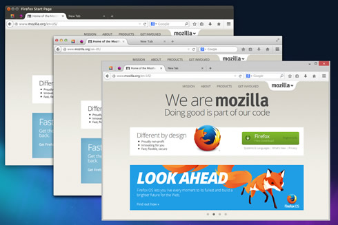
The new interface is also more extensible to better accommodate future features and additions; it offers a simpler presentation of add-ons; and a familiar look and feel across all Mozilla's platforms so that Firefox feels like Firefox everywhere.
One of the most noticeable changes in Australis is the new tab shape.
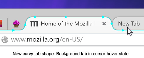
As important, though, is the distinction between foreground and background tabs. Background tabs are visually de-emphasized, leaving a space that’s uncluttered, where it’s quick to see which tab is currently selected. Tabs also slide forward into focus as you mouse over them, so you can better see where you’re heading.

In addition, Firefox’s tabs now sit higher in the titlebar, getting out of the way and leaving more screen space for web pages.
The default toolbar is also filled "carefully and sparingly" accoding to Mozilla. Some examples have already landed in earlier releases, like the forward button that only appears when there’s somewhere to go forward to, and the download button that shows progress when that’s relevant and hides it otherwise. In the new UI you’ll see this in a more prominent one-click bookmarking button paired with a button to get at those bookmarks.

These always-used-by-everybody controls are front and center. Widely- but less frequently-used controls are quickly close at hand in the new, touch friendly menu at far right. For the rest, the 2% use-cases, new simpler customization is easier to find and use.
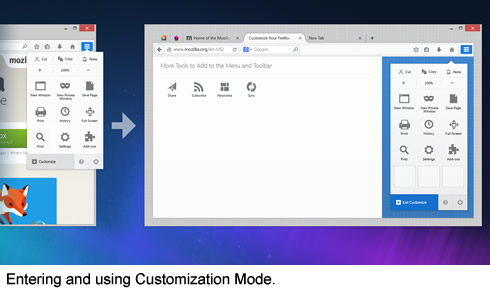
A new customization mode is very prominent in the new interface. Mozilla says this will serve as an on-ramp for more users to make Firefox into exactly what they need. It works with features shipped by default as well as with features that people add through add-ons.
