Google to 'iterate' on its Favicon Search Plan
Google on Friday changed its controversial plan to mix “favicons” in with search results, which critics had called a deceptive mix of search results and paid advertising.
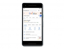
Last week, Google began putting small favicons next to search results in its desktop search. Critics called the favicons too visually similar to the small “Ad” label that Google attaches to sponsored results at the top of the page, and thus confusing to users.
Google on Friday removed the favicons from general Google search results in its Chrome browser.
The search giant said it would continue to tweak the designs in the coming weeks.
“Last week we updated the look of Search on desktop to mirror what’s been on mobile for months. We’ve heard your feedback about the update,” the GoogleSearchLiaison account tweeted. “We always want to make Search better, so we’re going to experiment with new placements for favicons….”
Google added that it will be testing other layouts with users over the coming weeks.
Google also said that the design had been well received by mobile users. “While early tests for desktop were positive, we are always incorporating feedback from our users,” it said in part. “We are experimenting with a change to the current desktop favicons and will continue to iterate on the design over time.”

