Twitter Makes Changes to its Website, Mobile Apps
Twitter is rolling out a series of tweaks to its website and mobile applications to further simplify the service's interface for its users.
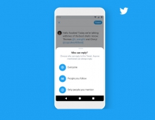
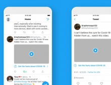
Changes include bolder headlines, more intuitive icons to make it easier to engage with Tweets, and live updates to reply, Retweet and like counts so people can watch conversations unfold in real time. The design also brings together the Profile, additional accounts, settings, and privacy tabs in a new side navigation menu on iOS, following a rollout of the feature on Android last year. Other notable changes are a new circular profile picture, a speech bubble instead of an arrow to reply to tweets and refinements to the fonts.
In addition, links to articles and websites now open in Safari's viewer in the Twitter app so you can easily access accounts on websites you're already signed into.
These updates will roll out across twitter.com, Twitter for iOS, Twitter for Android, TweetDeck, and Twitter Lite over the coming days and weeks.


