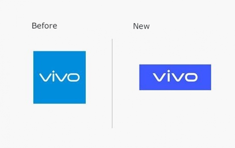
Vivo Unveils New Brand Logos
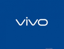
Vivo has recently unveiled its new visual brand identity that includes a new company logo, a unique Vivo brand color and exclusive Chinese Language and English Language Vivo fonts.
"Vivo has evolved from a follower to a leader in the tech and lifestyle industry." said Spark Ni, Senior Vice President of Vivo. "Through the new branding, we hope to redefine the brand's positioning in technology and innovation and express our brand vision of 'enjoying the extraordinary' with young consumers around the world through Vivo's unique visuals and creative spirit."
Vivo partnered with Danish designer Bo Linnemann to design the new logo. The new logo features simplified lines and sharpened angles "to reflect the forward-looking spirit of Vivo," according to the company.
The company has also revamped its "Vivo Blue" color by using a more saturated shade of blue as a result of a study by Vivo to better understand consumer visual habits and their visual receptiveness to digital displays.

Vivo has also revealed its English Language VivoType font, which comes with 6 weights and 2 widths, plus the Chinese Language VivoType font in 2 weights, to ensure that the fonts can be adapted seamlessly to different regions and languages. The new English Language and Chinese Language VivoType fonts are designed by Bo Linnemann and Chinese calligrapher Qiu Yin respectively.
The new branding will be updated to VI systems and rolled out to offline channels with immediate effect.


