What’s beta than Android 13?
Every year and with every release, we make Android better based on your feedback. With Android 13, we’re continuing to improve the quality and performance of the platform while building on many areas that matter most to you, like privacy and security, personalization and large-screen devices.
Today, we’re sharing more about Android 13 and releasing the second beta across many Android phones, tablets and foldable devices.
A foundation of privacy and security
In Android 13, we’re giving you more control over what personal information you share and more detailed control over what files your apps can access. Instead of permitting access to “Files and media,” there are two new categories you can control access to: “Photos & videos” and “Music & audio.” For even more specificity, a new photo picker lets you select the exact photos or videos you want to grant access to, without needing to share your entire media library with an app.
We’re also helping you be more deliberate about how you engage with apps. While app notifications often provide helpful and timely reminders, you should have more control over which apps you want to receive notifications from. In Android 13, apps must get your permission before sending you notifications. In addition, we’re reducing the number of apps that require your location. For example, you will no longer need to grant location to apps to enable Wi-Fi scanning.
Android 13 goes further to help you stay ahead of risks, with timely recommendations and options to enhance your privacy. You already receive an alert when an app accesses your clipboard. Now, Android will go further and automatically delete your clipboard history after a short period so apps are preemptively blocked from seeing old copied information.
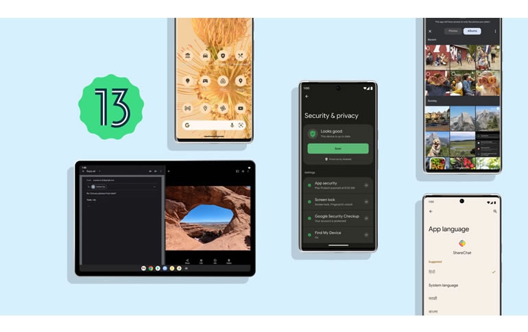
Later this year, we’ll introduce a unified Security & Privacy settings page in Android 13 that brings all your device’s data privacy and security front and center. This will provide a clear, color-coded indicator of your safety status and offer guidance and steps you can take to boost your security.
Within the Security & Privacy settings page, there is a color-coded safety status that indicates safety status. On the top of this user’s screen it reads “Looks good” with a green check mark beside it.
Personalized experiences for you
Last year, we introduced Material You to help your phone adapt to your style and preferences. With Android 13, we’re going further to customize your phone’s look and feel with pre-made color variants. Once a color scheme has been selected, you’ll see beautiful color variants applied across the entire OS to accentuate your wallpaper and style.
Different color variants applied across the calculator app of 4 phone shells on a floral orange wallpaper
Android 13 also extends color theming of your app icons beyond Google apps. Starting with Pixel devices, you’ll be able to turn on the “Themed icons” toggle in your settings to have all supported apps also match your phone’s colors in a minimal, modern and consistent look.
Apps on the home screen are all light orange and gray to match the orange floral wallpaper
We’re also introducing a new media control that tailors its look based on the music that you’re listening to, featuring the album’s artwork.
A phone’s lockscreen with a media player in the center with colorful artwork playing a song.
Personalization in Android 13 extends beyond the design and aesthetic of the phone’s interface to other areas that are important and unique to you, like your language preferences. If you’re multilingual, you likely use different languages depending on the situation and may change how you communicate from one instance to the next. For example, you might enjoy social media in one language, but bank in another. Android 13 helps you use language as fluidly as you do in real life, so you can select a different language preference for each of your apps in Settings.
While in Settings, a user selects ShareChat and has a list of languages to choose the app to run in such as the System language, Hindi, Marathi, Bengali, Gujarati, Punjabi and more
Tablets just keep getting better
Android 12L’s updates optimized the layout for bigger screen devices. Android 13 builds on this foundation by introducing better multitasking capabilities for tablets. With the updated taskbar, you can easily switch your single tablet view to a split screen. Just drag and drop any second app in your app library onto your screen and you’ll be able to do two or more things at once with ease.
A tablet user drags and drops apps like Google Photos and Gmail into split screen from the new All Apps entry point in their taskbar.
We’re also improving the experience for when you’re writing or drawing with a stylus pen. In Android 13, you can rest your hand comfortably on the screen without worrying about it being misidentified as a stylus pen, reducing any unintended actions.
We know these changes don’t mean much if apps aren’t built for the larger screens. So over the next few weeks, we’ll be updating more than 20 Google apps to take full advantage of the extra space with added functionality. Many of the third-party apps you love — like TikTok, Facebook and Zoom — will be revamped to make your experiences on tablets even better.
Try out Android 13 features, with more on the way
Android 13 has much more in store, including features that shape modern standards for audio and video like HDR video, Spatial Audio and Bluetooth Low Energy Audio.
You can find many of these features today in the second beta of Android 13. We have a great lineup of beta partners and we can’t wait for you to try it on your favorite device http://android.com/beta

