Mozilla Unveils New Logo, Brand Identity
Mozilla is updating their brand identity using Mozilla open source principles, and currently, the organization is starting to apply their updated identity, to be made public this month.
Mozilla is conducting an Open Design process, through a guided and gated design process, in four phases: IDEATION , CONCEPTING Next, REFINEMENT, and finally GUIDANCE. Currently the project is in the last GUIDANCE phase where Mozilla is creating style guides.
At the core of this project is the need for Mozilla's purpose and brand to be better understood by more people.
"We want to be known as the champions for a healthy Internet. An Internet where we are all free to explore and discover and create and innovate without barriers or limitations. Where power is in the hands of many, not held by few. An Internet where our safety, security and identity are respected," Mozilla said in a blog post. "Our brand identity - our logo, our voice, our design - is an important signal of what we believe in and what we do. And because we are so committed to ensuring the Internet is a healthy global public resource, open and accessible to everyone, we've designed the language of the Internet into our brand identity."
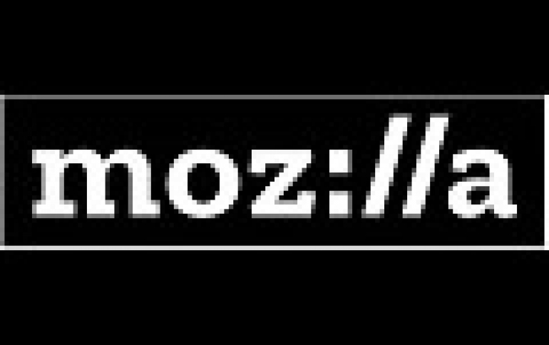
Today, Mozilla shared a new logo and a proposed color palette, language architecture, and imagery approach.
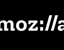
The new logo with its nod to URL language reinforces that the Internet is at the heart of Mozilla. "We are committed to the original intent of the link as the beginning of an unfiltered, unmediated experience into the rich content of the Internet," Mozilla said.

The font for the wordmark and accompanying copy lines is Zilla. Created for us by Typotheque in the Netherlands, Zilla is free and open to all.
Typotheque was an historic partner to Mozilla. They were the first type-foundry to release Web-based fonts, and Mozilla's Firefox web browser was an early adopter of Web fonts.
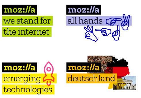
Selected to evoke the Courier font used as the original default in coding, Zilla has a journalistic feel. It bucks the current convention of sans serif fonts. Anyone can create the Mozilla logo by typing and highlighting with the Zilla font, making the logo open and democratic. The black box surrounding the logo is a key building block of the design, and echoes the way we all select type in toolbars and programs.
The color palette, derived from the highlight colors used by Firefox and other web browsers, distinguishes the Mozilla brand from its contemporaries. Color flows into the logo and changes according to the context in which the logo is used.

Copy lines to the right or below the logo hold core Mozilla messages. They also hold program, event, and team names - simplifying and unifying a multitude of different Mozilla activities.
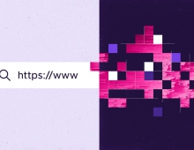
In digital applications, ever-changing imagery represents the unlimited bounty of the online ecosystem. Static applications of Mozilla's identity system include multiple, layered images as if taken as a still frame within a moving digital experience.
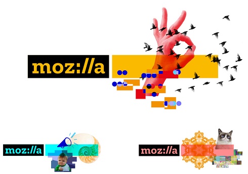
Mozilla will invite artists, designers, and technologists to contribute to an imagery collective, and will code curated GIFs, animations, and still images to flow into mozilla.org and and other digital experiences.


