Volvo’s Polestar 2 Electric Car to Come With Android OS
Polestar, Volvo’s performance brand which has been relaunched as an electric brand, is worling on a Tesla 3 competitor, the Polestar electric sedan powered by an Android-based operating system
When Volvo rebranded Polestar two years ago, the company unveiled its first vehicle, the Polestar 1. This one was an expensive plug-in hybrid. Now Polestar plans to bring an all-electric “Tesla Model 3 competitor” to production a year later.
The Polestar 2 will be the first car with a software setup that will update often and automatically. It comes with an Android-based operating system that’s always connected to the internet and receives over-the-air updates just like your smartphone.
The Polestar 2 also features apps, services, and technologies that people already use every day on their smartphones (such as Google Maps and the Google Assistant). Thanks to the Google Play Store, those apps you use on your phone are also on hand in your car: stream playlists or podcasts, get real-time traffic and weather updates, stay in touch with your nearest and dearest, and more.
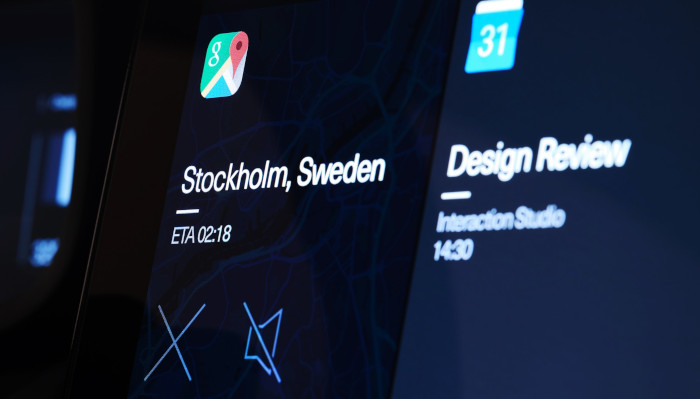

It will also come equipped with other features, including an embedded Google Assistant. From optimising the temperature to picking a song, the Google Assistant lets you control things with your voice, leaving you free to focus on driving.
The second feature is something being used in cars all over the world, but on a secondary device. Google Maps will come pre-installed navigation app for the Polestar 2. Google Maps offers features like real-time traffic information and location hours while removing the need to consult a phone while driving.
Amil Gasanin, the graphic designer responsible for the Polestar 2 UI design, said that Polestar decided to make somec changes to Google's UI. The company enlarged the buttons, offering a bigger touch area to help minimise driver distraction.

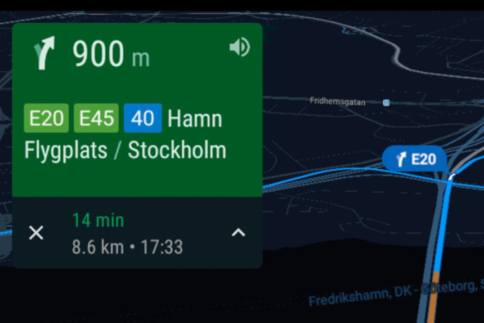
Another UI design issue is how to structure menus. Navigating a labyrinth of collapsible menus is taxing enough even when you aren’t behind the wheel of a vehicle. Polestar’s answer to this was simple and elegant. Instead of unwieldy collapsible menus, you have a four-tile grid system. Each tile has default app groupings which can be customised, and three large buttons for quick actions; shortcuts which avoid tedious (and dangerous) slogging through menus. Instead of riotous colour schemes and frenetic font combinations, it’s minimalist and designed for optimal performance.
Another design choice which makes the UI more driver-centric, while reducing time spent not focusing on the road, is a screen containing the apps accessed most often. This reduces the amount of interactions needed to reach the most-used functions, for example the 360° camera, explained Aloka Muddukrishna, who is responsible for Polestar 2’s User Experience.
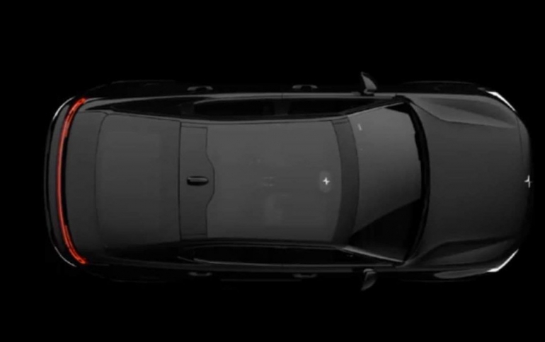
Earlier this month, Volvo they released the first image of the Polestar 2 and some specs for the upcoming vehicle. It will offer about 300 miles of range, a 400 HP horsepower, and will be sold in the Tesla Model 3 price range.


