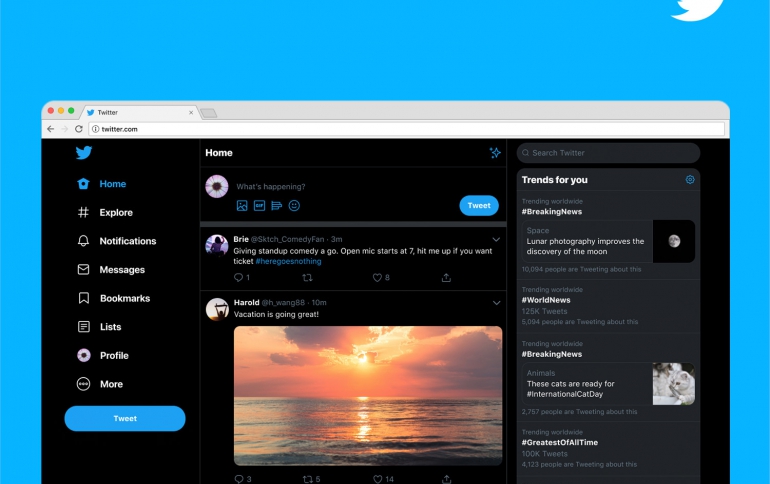
Redesigned Twitter is Rolling Out
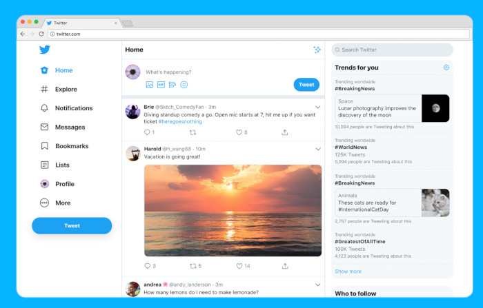
Twitter has started to roll out a new Twitter.com – a refreshed and updated website that is faster, easier to navigate and more personalized.
The site has an updated look that is more consistent with the Twitter you see on other devices, making it easier to access favorite features, and with more options to make it your own.
Twitter.com’s features make conversations easier to find and follow:
- More of What’s Happening: Twitter has brought over Explore to bring you the same content found in Twitter's apps; expect more live video and local moments personalized for wherever you are in the world. Get context with profile information within conversations and check out your Top Trends in any view.
- Easy Access to Features: Bookmarks, Lists, and your Profile are right up front and have their own spot on the side navigation, making it faster to jump between different tabs.
- Direct Messages All in One Place: Direct Messages have been expanded so you can see your conversations and send messages all from the same view.
- Login, Logout Struggle No More: Whether you have one profile or a few, now you’re also able to switch between accounts faster, directly from the side navigation.
- Twitter is bringing different themes and color options, along with two options for dark mode.
