Microsoft Re-designs Task Manager For Windows 8
Microsoft has updated the Task Managerin Windows 8, offering a new look as well as some new scenarios and a new way of tuning the tool for "both ends of the spectrum" in terms of end-users and those that need very fine-grained control over what is going on with their PC.
Ryan Haveson, the group program manager of Microsoft's "In Control of Your
PC" team, provided details about the new Task Manager.
Starting with the appearance, Microsoft tried to add new functionality without overwhelming users. To solve this, the company pivoted around a "More/Fewer details" button similar to the new copy file dialog model.
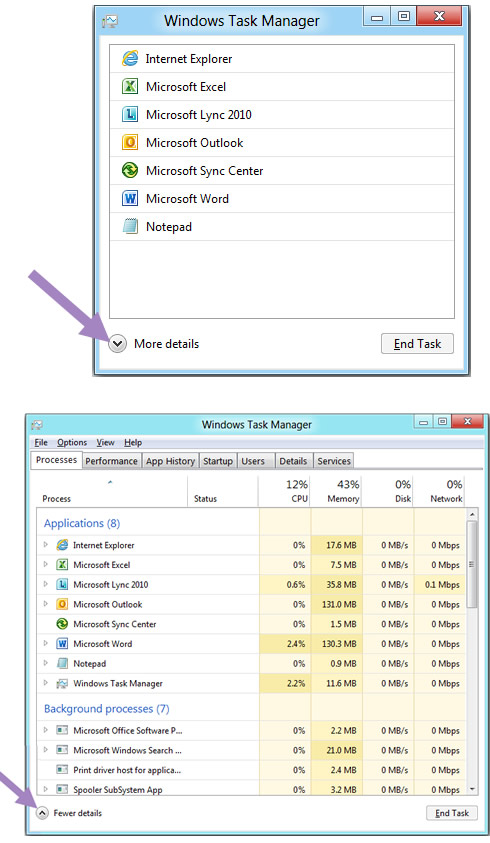
The default view ("Fewer details") is built around the core scenario of finding an application and closing it. Microsoft removed everything not focused on the core task of killing apps. No tabs will appear in this view, it shows just the apps and removes individual windows that can't be killed anyway. Microsoft also took out things such as resource usage stats and technical concepts that most users don't understand. In addition, if you click "End task" the system ask you, "Are you sure?" - it will just kill the app.
In the "More details" view Microsoft stayed with the existing tabbing model of Task Manager and focus on improving the content of each of the tabs.
The most noticeable difference in the new "More details" processes tab is the new heat map, which represents different values with color. The nice thing about a heat map is that it allows you to monitor anomalies across multiple resources (network, disk, memory, and CPU utilization) all at the same time, without having to sort the data. It also allows you to find the hot spot instantly without needing to read numbers or understand concepts or specific units.
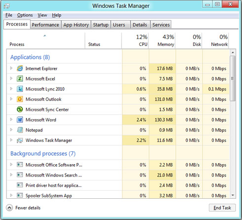
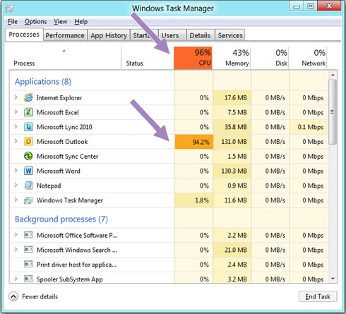
The new Task Manager also shows network, Memory and Disk resources at the same level of detail as memory and CPU.When a particular resource is being used at a rate above a threshold number, the column header will light up to draw your attention to it. Think of this as a warning indicator, letting you know a good place to start looking if you are experiencing performance issues. Below, you can see that the CPU column header is highlighted to draw your attention to the fact that you may have multiple applications competing for CPU time.
The new task manager also shows more user-friendly names for the background processes. For example, the line item for "splwow64.exe" showed in the old Task Manager will now appear as "Print driver host for applications". But if you still want to see the executable name, of course you can add it back as an optional column.
In today's Task Manager, it is hard to know which processes correspond to an application (apps are generally safe to kill), which are Windows OS processes (killing some of these can cause a blue screen), and which are miscellaneous background processes that may need to be explored more deeply. The new Task Manager shows processes grouped by type, so it is easy to keep these separated while still providing an ungrouped view for situations where you need it.
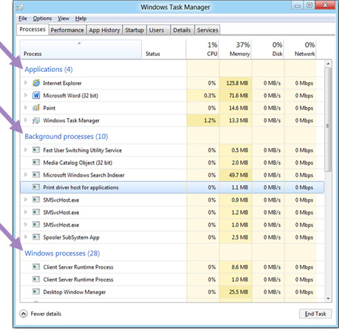
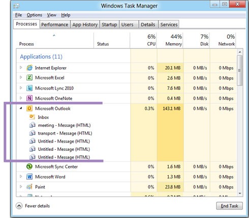
In the old Task Manager is that the Applications tab was a flat list that included all of the top-level windows from all processes in the system. While the list of top-level windows is interesting information to have, it is often overwhelming to look at and sometimes a single window cannot be killed without closing all the other windows for that process. To address this, the new Task Manager now groups top-level windows under their parent process. It allows for a much cleaner view for typical usage, helps you focus on killable processes, process resource usage, and allows you to see which windows are owned by each process so you know what will be closed if you kill it.
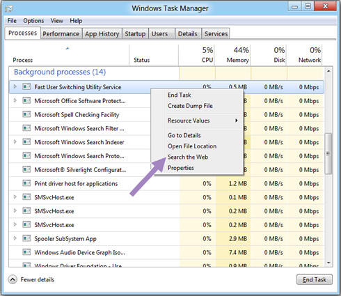
The new Task Manager also integrates a search context menu on right-click, so you can go directly to your default search engine (which you can customize) to see more details and relevant information. This can make a huge difference when deciding whether a background process is doing something useful or just wasting cycles.
If you open up Windows 7 Task Manager to the Processes tab and select "Show process from all users," you will probably see eight seemingly identical instances of "svchost.exe". This is one of the most commonly noted "not very informative" sources of information Microsoft provided. With the new Task Manager, the operating system shows all of the services grouped by process with friendly names for each of them, so you instantly can see what is going on when an instance of svchost is consuming a lot of resources:

Starting with the appearance, Microsoft tried to add new functionality without overwhelming users. To solve this, the company pivoted around a "More/Fewer details" button similar to the new copy file dialog model.

The default view ("Fewer details") is built around the core scenario of finding an application and closing it. Microsoft removed everything not focused on the core task of killing apps. No tabs will appear in this view, it shows just the apps and removes individual windows that can't be killed anyway. Microsoft also took out things such as resource usage stats and technical concepts that most users don't understand. In addition, if you click "End task" the system ask you, "Are you sure?" - it will just kill the app.
In the "More details" view Microsoft stayed with the existing tabbing model of Task Manager and focus on improving the content of each of the tabs.
The most noticeable difference in the new "More details" processes tab is the new heat map, which represents different values with color. The nice thing about a heat map is that it allows you to monitor anomalies across multiple resources (network, disk, memory, and CPU utilization) all at the same time, without having to sort the data. It also allows you to find the hot spot instantly without needing to read numbers or understand concepts or specific units.

The new Task Manager also shows network, Memory and Disk resources at the same level of detail as memory and CPU.When a particular resource is being used at a rate above a threshold number, the column header will light up to draw your attention to it. Think of this as a warning indicator, letting you know a good place to start looking if you are experiencing performance issues. Below, you can see that the CPU column header is highlighted to draw your attention to the fact that you may have multiple applications competing for CPU time.

The new task manager also shows more user-friendly names for the background processes. For example, the line item for "splwow64.exe" showed in the old Task Manager will now appear as "Print driver host for applications". But if you still want to see the executable name, of course you can add it back as an optional column.
In today's Task Manager, it is hard to know which processes correspond to an application (apps are generally safe to kill), which are Windows OS processes (killing some of these can cause a blue screen), and which are miscellaneous background processes that may need to be explored more deeply. The new Task Manager shows processes grouped by type, so it is easy to keep these separated while still providing an ungrouped view for situations where you need it.

In the old Task Manager is that the Applications tab was a flat list that included all of the top-level windows from all processes in the system. While the list of top-level windows is interesting information to have, it is often overwhelming to look at and sometimes a single window cannot be killed without closing all the other windows for that process. To address this, the new Task Manager now groups top-level windows under their parent process. It allows for a much cleaner view for typical usage, helps you focus on killable processes, process resource usage, and allows you to see which windows are owned by each process so you know what will be closed if you kill it.

The new Task Manager also integrates a search context menu on right-click, so you can go directly to your default search engine (which you can customize) to see more details and relevant information. This can make a huge difference when deciding whether a background process is doing something useful or just wasting cycles.

If you open up Windows 7 Task Manager to the Processes tab and select "Show process from all users," you will probably see eight seemingly identical instances of "svchost.exe". This is one of the most commonly noted "not very informative" sources of information Microsoft provided. With the new Task Manager, the operating system shows all of the services grouped by process with friendly names for each of them, so you instantly can see what is going on when an instance of svchost is consuming a lot of resources:


