Windows Vista Public Beta 1 - Part 2
13. Visual Improvements & New features Page 4
Review Pages
2. Technical Improvements Page 1
3. Technical Improvements Page 2
4. Technical Improvements Page 3
5. Technical Improvements Page 4
6. Technical Improvements Page 5
7. Technical Improvements Page 6
8. Technical Improvements Page 7
9. Technical Improvements Page 8
10. Visual Improvements & New features Page 1
11. Visual Improvements & New features Page 2
12. Visual Improvements & New features Page 3
13. Visual Improvements & New features Page 4
14. Visual Improvements & New features Page 5
15. Visual Improvements & New features Page 6
16. Visual Improvements & New features Page 7
17. New Applications Page 1
18. New Applications Page 2
19. Other improvements and Tweaks
20. Current Bugs and other Problems
21. Final thoughts
On the left hand side, we can see the Navigation Panel that helps explore and view your files quicker. Navigation Bar options changes according to the type of the files that the folder you browse contains.
The standard edit menu to copy, paste, etc files and shortcuts that Windows XP has, has been replaced with a new toolbar that is situated under the address bar. In this new toolbar, we have a button called "Organize", which drops down a menu that includes choices like Rename,
![]()
Move, Copy, E-mail, and Delete, a View button to help configure the size and style of the icons, and a show/hide button lets lets you set the preview panel, Classic Menu, status bar and Navigation panel to be visible or hidden. It also has a "Share" button, and some shortcuts to other locations.
 |
 |
The new menu options |
|
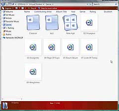
The new way of viewing files: Windows Vista has a new way for setting the style and the size of your file icons by using a slider bar. This reminds me of the way that Photoshop CS2 dose it. There are 5 styles to choose from and for each style, the user can set the size of the icons by sliding the bar up or down. Very convenient
 |
From very small ... |
... to very huge icons |
 |
 |
|
A lot of users will find very useful, the new way of setting the size and the style of your file icons |
||
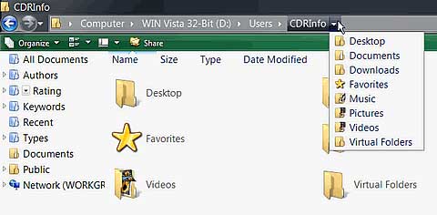
The breadcrumb bar: We will now see some of the more interesting feature of Windows Vista. The address bar from previous releases has been replaced with a breadcrumb bar. What does a breadcrumb bar do? From now on, users don't have to enter the location that they want to go to manually (they still can if they want too though). By clicking on the arrow, right of the folder's name, a drop down list with sub-folders appears from which you can select a folder that you want to navigate to. So for example, let's assume that you want to go to the following location: D:\Users\Administrator. and you are in the D:\Users\CDRInfo. Normally, you'd have to hit the back button, look for the Administrator sub-folder and double click on it. Now, you can simply click on the arrow, right of the Users folder and select Administrator from the drop down list. An extremely useful an time saving feature. After using this feature, you will probably not want to see the classic address bar again.
Review Pages
2. Technical Improvements Page 1
3. Technical Improvements Page 2
4. Technical Improvements Page 3
5. Technical Improvements Page 4
6. Technical Improvements Page 5
7. Technical Improvements Page 6
8. Technical Improvements Page 7
9. Technical Improvements Page 8
10. Visual Improvements & New features Page 1
11. Visual Improvements & New features Page 2
12. Visual Improvements & New features Page 3
13. Visual Improvements & New features Page 4
14. Visual Improvements & New features Page 5
15. Visual Improvements & New features Page 6
16. Visual Improvements & New features Page 7
17. New Applications Page 1
18. New Applications Page 2
19. Other improvements and Tweaks
20. Current Bugs and other Problems
21. Final thoughts

